ActuAir CO2 Display
Development and Evaluation of an innovative room divider for displaying CO2 levels at the workplace
2022-2023
Duration: 6 months
Role: Human-Computer-Interaction Researcher (PhD)
Team: Lenia Margariti (Design, Fabrication), Jan Kučera (software engineering)
Methods: Fabrication, hardware, software, Physical Prototyping, User Experience Evaluation, Design Criteria, Co-creation
Impact: Workplace Innovation for Health & Wellbeing. Developed a customizable modular tool with which building users can visualize CO2 data in different building locations to create awareness on varied air quality levels.
Overview
How can environmental data become part of the workplace experience rather than remain hidden in dashboards?
This project explored how real-time building data —including CO₂ levels, temperature, and humidity— could be transformed into tangible, intuitive interactions that help occupants better understand and respond to their environment. Working at the intersection of UX, IoT, and physical computing, I designed and evaluated a modular shape- and colour-changing display that communicated workplace air quality through dynamic physical feedback.
I led the design, development, and evaluation of an innovative workplace technology that transformed environmental sensor data into tangible, interactive feedback to improve occupant awareness and wellbeing. I investigated how environmental information could support awareness, comfort, and wellbeing while reducing reliance on traditional screen-based interfaces.
The Challenge
Modern workplaces generate large amounts of environmental data, including information about air quality, temperature, and humidity. However, this information is rarely accessible or meaningful to building occupants.
The challenge was to design an alternative way of communicating environmental conditions that:
- Increased awareness of workplace conditions.
- Was intuitive and engaging without requiring screens.
- Supported informed decision-making about where and how people work.
- Integrated seamlessly into the workplace environment.
My Role
I led the end-to-end design and delivery of the project, including:
- Designed and prototyped a novel IoT-enabled workplace experience that transformed complex environmental data into intuitive, human-centred interactions.
- Conducted mixed-methods user research with 21 participants to evaluate usability, comprehension, and engagement with ambient data visualisation concepts.
- Synthesised qualitative findings into actionable design principles for communicating environmental and wellbeing data through physical interfaces.
- Generated insights into how environmental information can support workplace awareness, comfort, and wellbeing while reducing reliance on traditional dashboards and screens.
- I worked across design, software (supported by Jan Kučera), and hardware to deliver a fully functional prototype and real-world deployment.
The Display
I designed a modular interactive display that visualised environmental conditions through dynamic changes in shape and colour. The display integrated live and historical building sensor data through the building’s API and enabled users to explore environmental conditions across different workplace locations through configurable visual and physical feedback.
The display consisted of inflatable silicone-and-fabric modules equipped with LEDs and connected to live building sensor data. Users could arrange the modules into different configurations, transforming them into soft workplace dividers that simultaneously acted as ambient information displays.
The system visualised real-time and historical environmental data—including CO₂, temperature, and humidity—using combinations of:
- Colour transitions (green → yellow → red)
- Inflation and deflation
- Pulsing and color animation patterns
- Modular spatial arrangements
A custom web application allowed users to select rooms, data streams, and display configurations, enabling exploration of both live and historical building data.
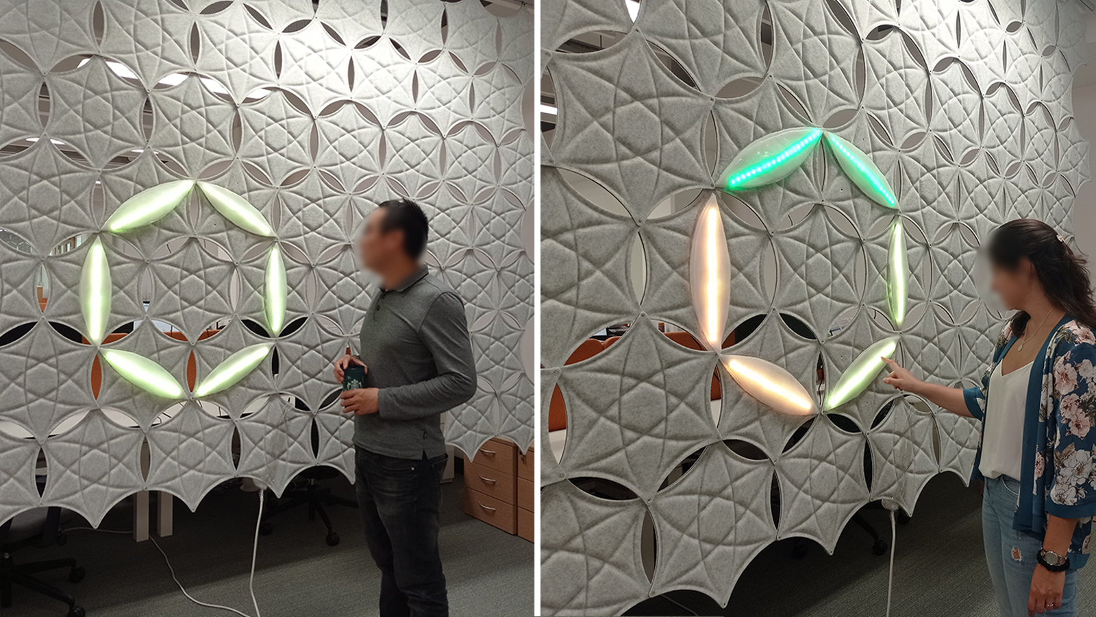 Above: Building users observing and interacting with the display. I physicalized changes in CO2 levels through shape and color-changing silicon and fabric modules, with integrated LED strips. These modules can be put together and be re-arranged by the building users to form soft barriers in the workplace that simultaneously function as data displays. CO2 data include both real time and historical (24-hour timeframe) sensory readings (CO2, temperature, humidity) of the building’s rooms, obtained from the building’s open API.
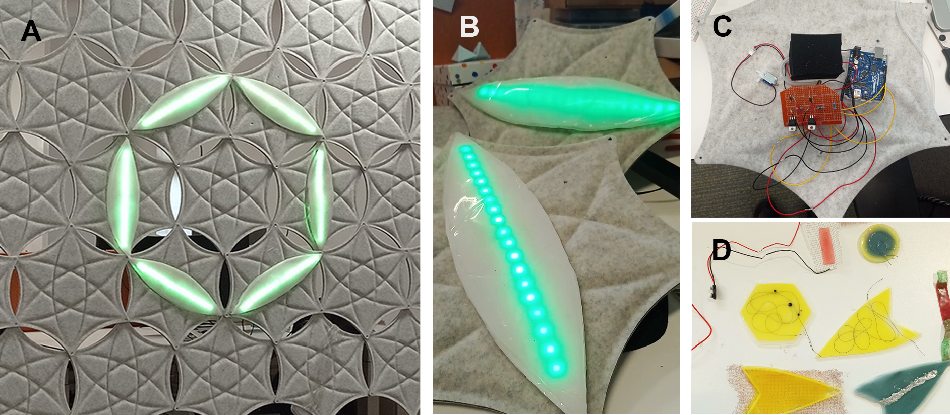 Above: A. The display’s modules in the default set up in a circular arrangement. Green is an indication of good air quality. The changes in CO2 are depicted with inflation/deflation and color change (green-yellow-red scale). The combination of using light color and inflation as parameters to communicate CO2 levels were subject to user testing. B. Testing LED color diffuse, in an inflated and a deflated module. C. Electronics at the back of each module. D. Material exploration.
The software developed in React, Axios with the help of Jan Kučera offers three main options:
- It allows users to select the room and data stream (CO2, temperature, humidity) they wish to physicalize using one or multiple components.
- It allows users to select a room and a number of components, and displays the historical data (measurements over the past 24hours) in these components, and
- It allows the researcher/admin and/or users to manually customize parameters such as the RGB color of the LEDs, the LED intensity, the duration of inflation/deflation and the pulsing or pausing of inflation, in order to explore feedback combinations. Additionally, we used Luftio table sensor and their API to be able to use the modules at home or at a remote desk.
Research & Evaluation
To understand how people interpreted and interacted with physical environmental feedback, I conducted a series of co-design and evaluation activities with 21 workplace occupants over June-August 2022.
Methods included:
- Design evaluation workshops
- Co-design sessions
- Contextual interviews
- Prototype testing in situ
Participants explored different display configurations, interaction behaviours, and visualisation approaches while reflecting on their understanding of the data, perceived meaning, and preferred interactions.
The research focused on how physical form, movement, colour, and spatial arrangement influence feedback interpretation and awareness; to inform smart workplace decision-making and future innovations.
Outcomes
The project demonstrated that physical and ambient representations of environmental data can support workplace awareness in ways that traditional dashboards cannot.
Key outcomes included:
- Designing and deploying a fully functional IoT-enabled workplace experience.
- Generating design principles for communicating environmental and wellbeing data through physical interfaces.
- Identifying how shape, movement, colour, and spatial arrangements influence interpretation of environmental information.
- Demonstrating opportunities for integrating workplace data into everyday environments through calm, ambient interactions.
Impact
I designed and deployed an IoT-enabled workplace experience that transformed environmental sensor data into shape-changing physical feedback, helping occupants better understand and respond to workplace conditions.
The project resulted in a peer-reviewed publication at the ACM CHI 2024 Conference and received an Honourable Mention Award, recognising its contribution to innovative human-centred approaches for communicating environmental data in workplace settings - see the publication here.
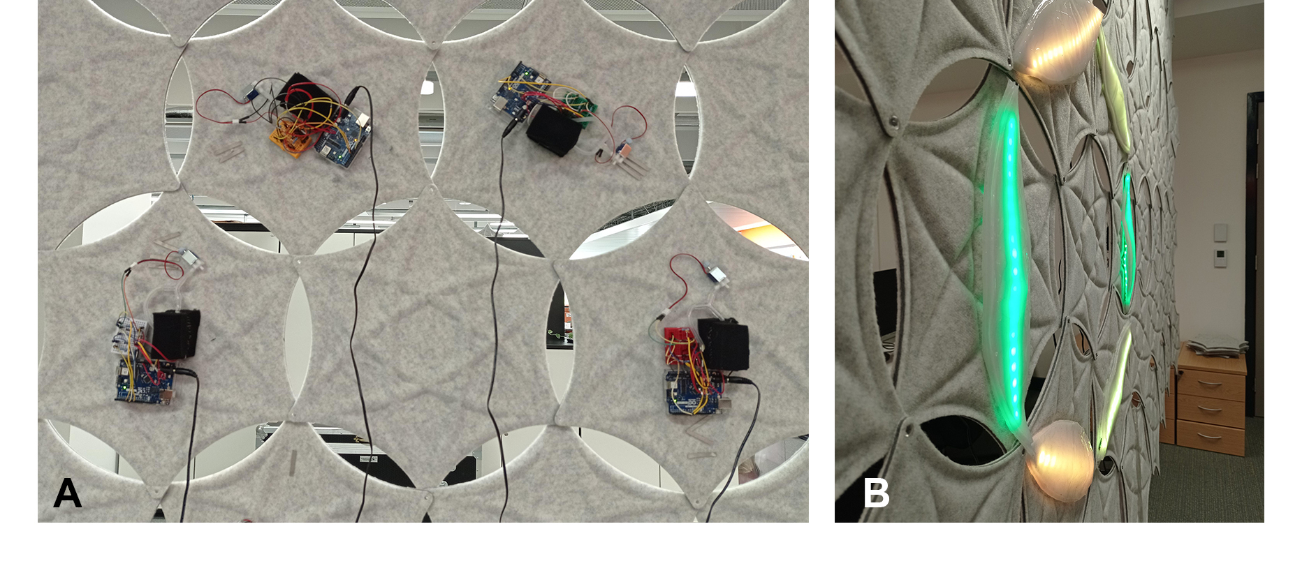 Above: The electronics exposed in the back of the modules. Each module operates with a wireless Arduino connected to a local server built on Raspberry Pi. The server is fetching AQ data (CO2, temperature, humidity) from the building’s open API and wirelessly communicates with the Arduinos which control the LED’s intensity and color (green-yellow-red gradient), and the air-pumps and valves for each module - e.g. the amount of air pumped in and out, and the time they stay inflated or pulsing. All hardware (Arduinos, air -pumps and valves) are integrated in each module, enabling them to act as stand-alone and in coordination with other modules.
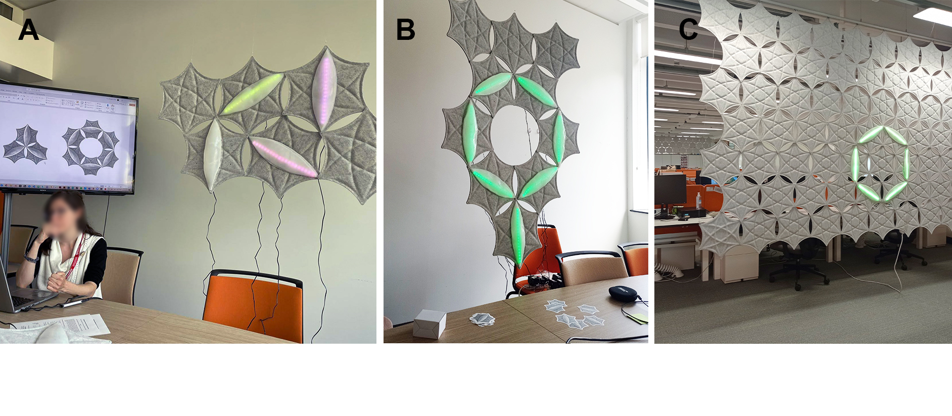 Above: Testing different modular arrangments and LED/inflation customizations with participants.
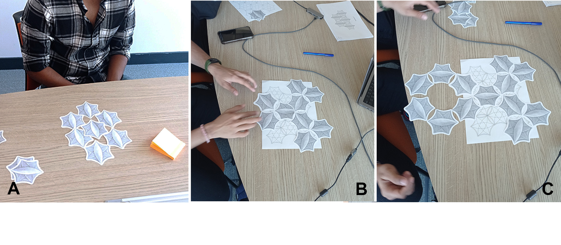 Above: Participants co-designing their preferred display arrangments using paper modules.
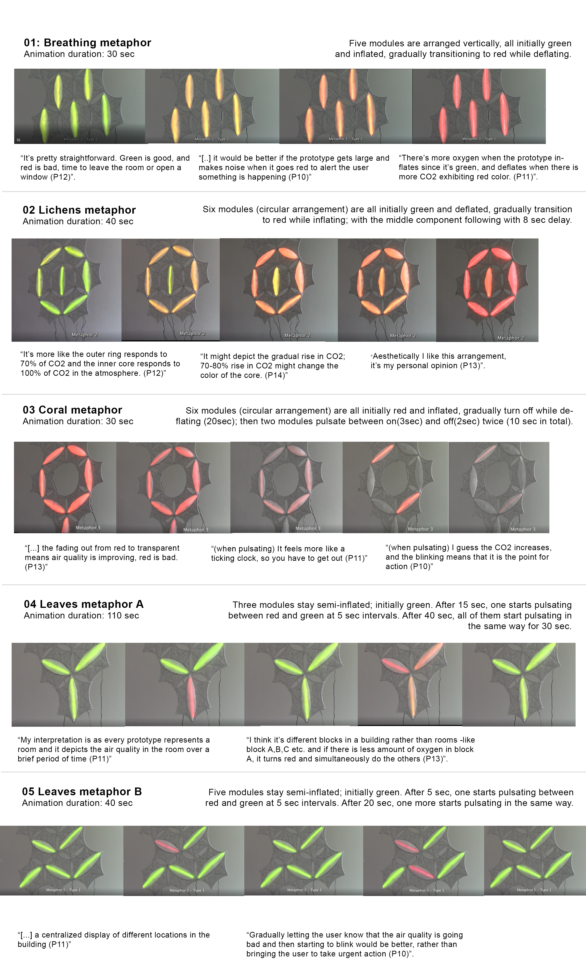 Above: Different display arrangments and LED/inflation combinations that were tested with participants, and some of their responses (in quotes). Participants were asked to reflect on what they understand in terms of feedback, what spatial-data associations do they conceive, and what is their preferred display arrangement.